
Histograms in Octave
In this tutorial, I will show you how to create a histogram using Octave.
But what is a histogram exactly? It is a type of bar chart that is widely used in statistics to graphically represent data on a Cartesian plane.
Let's take a practical example.
To create a histogram, we first need to create an array that contains a sequence of values.
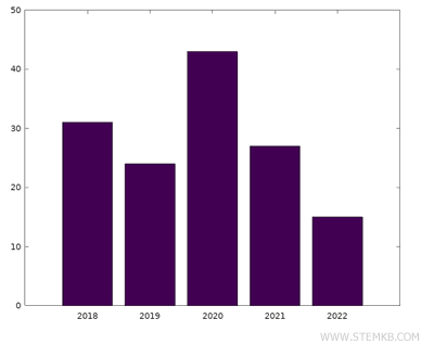
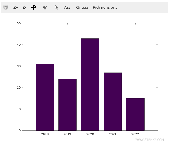
For instance, we can use the years from 2018 to 2022:
>> x = [ 2018 2019 2020 2021 2022 ]
Next, we need to create another array that contains a sequence of data.
For example, we can use the points of a soccer team during a championship:
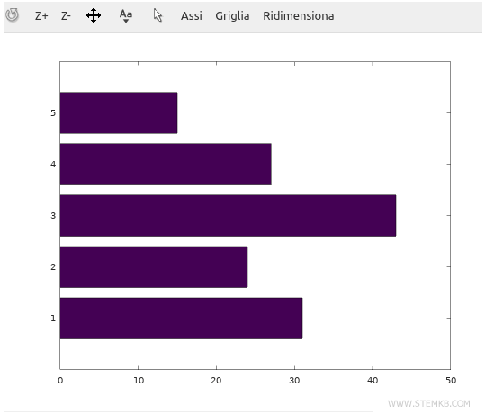
>> y = [ 31 24 43 27 15 ]
Note that both arrays must have the same number of elements. In this case, both the array x and the array y contain 5 elements.
To create the bar chart, we can use the command bar(x,y)
bar(x,y)
This command will generate and display the bar chart using the data from the arrays x and y.
The array x will define the labels on the horizontal axis, while the array y will define the values on the vertical axis of the diagram.
Alternatively, we can create a horizontal histogram by using the command barh(x,y)
barh(x,y)
This command will display the histogram with the bars extending from left to right.
Lastly, another useful command for creating histograms in Octave is the hist() command
hist(x,y)
If you found this online lesson on Octave by Nigiara helpful, make sure to keep following us for more.