
How to Customize Graphs on Octave
In this tutorial, I will show you how to customize graphs on Octave by adding a title, a legend, axis labels, a grid, and more.
Let's begin with a practical example.
Before creating a graph, I recommend clearing the screen using the clf function.
>> clf
Next, create an array with x values.
>> x = linspace(1,100,100);
Then, create an array with y values.
>> y1=x.^2;
>> y2=x.^2.2;
All arrays are made up of 100 elements.
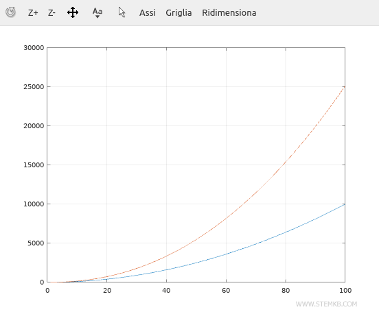
To add a visible grid, type grid on
>> grid on
A grid will appear on the graph.
Nota. To remove the grid, type "grid off."
To draw the graph, use the plot() function.
In this case, we have a multiple graph with two functions.
>> plot(x,y1, x,y2)
The graph will be displayed as follows.
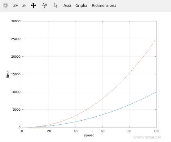
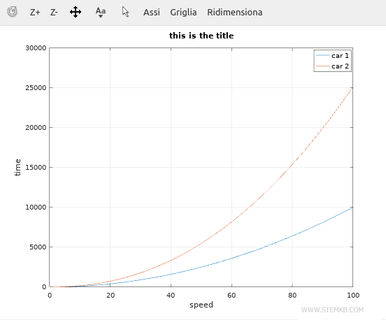
To add labels to the axes, use the xlabel and ylabel" commands.
>> xlabel('speed')
>> ylabel('time')
The labels will appear immediately on the horizontal (x) and vertical (y) axes.
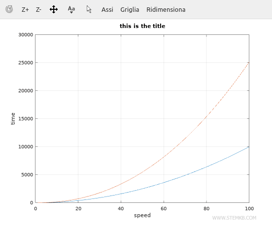
Now, add a title to the graph using the title() function.
>> title('this is the title')
The title will be displayed in bold at the top of the graph.
Finally, display a legend on the margins of the graph using the legend() function.
>> legend('car 1', 'car 2')
The legend will be added in the top-right corner.
With these tools, you can customize your graphs on Octave.
If this Niagara lesson was helpful, please continue to follow us.