
Pie Charts in Octave
In this online lesson, I will show you how to create a pie chart using Octave.
What is a pie chart? Also known as a pie graph or circle graph, it is a circular graph that displays categories as slices of a whole, with each slice representing a percentage.

Here's a practical example.
First, create an array with some values.
>> x = [ 5 , 10 , 15 ];
The total of the array is 5 + 10 + 15 = 30.
To draw a pie chart of the array x, use the pie() function.
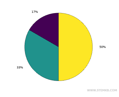
>> pie(x)
This will give you the pie chart of the data.
As you can see, in the pie chart, the value 15 represents half of the chart because it is 50% of the total (30).
The other values, 10 and 5, have smaller slices, representing 33% and 17%, respectively.
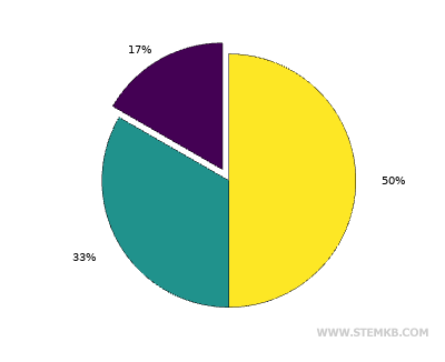
If you want to separate one or more slices from the pie, create another array where you indicate the edges of the slices.
For example, apply an edge of 1 to the smallest slice to remove it from the chart while leaving the other slices intact.
>> b = [ 1 , 0 , 0 ];
The array "b" must have the same number of elements as the array "x," in this case, three.
Now, redraw the pie chart using the pie() function and both arrays.
>> pie(x,b)
The first slice is now separated from the pie chart.
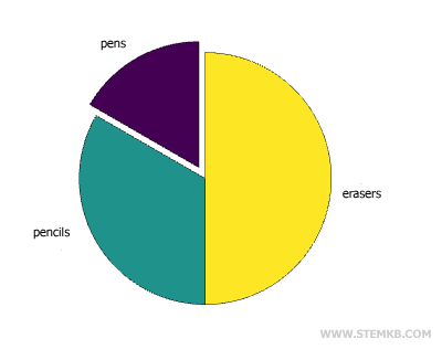
If you want to display labels instead of percentages, create an array of cells.
>> label={"pens","pencils","erasers"};
Then, redraw the pie chart and add the "label" array as a third parameter.
>> pie(x,b,label)
Each slice is now associated with a label.
If you enjoyed this online lesson by Nigiara, continue to follow us.