
An Introduction to Data Visualization in R
Welcome to our tutorial on mastering data visualization with diagrams and charts in R, focusing on the powerful ggplot2 library.
ggplot2 is a versatile tool for transforming data into insightful graphics, enabling the creation of complex charts from straightforward, intuitive components. It supports an extensive range of chart types.
Imagine we have a dataset named "dati.csv" that we wish to bring to life visually.
The initial step involves importing this data into R using the read.csv function:
dati <- read.csv("dati.csv")
For the purposes of this guide, we'll work with a dataset built into R, known as "mtcars".
This dataset offers insights into the fuel efficiency (in miles per gallon, mpg) and various performance metrics of cars.
dati <- mtcars
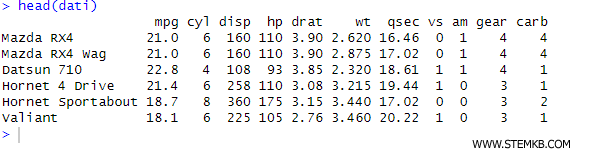
Before diving into visualization, let's familiarize ourselves with the dataset's content.
To glimpse the first few rows, we use head(dati), and for a comprehensive statistical summary, summary(dati) is our go-to command.
head(dati)
summary(dati)
The head() function is particularly useful for understanding the dataset's field names.
Among R's graphical data visualization libraries, ggplot2 stands out for its popularity and power.
However, before we can harness its capabilities, it must first be installed in our R environment.
install.packages("ggplot2")
With installation complete, loading it into memory is our next step:
library(ggplot2)
Suppose our goal is to explore the distribution of the "cyl" (cylinders) variable within our dataset.
This can be achieved with the ggplot() function, as follows:
ggplot(data, aes(x=cyl)) +
geom_bar()
This function crafts a bar chart that tallies the frequency of different cylinder counts among the cars in our dataset.
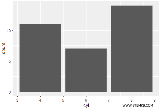
The chart reveals a predominance of cars with 8 cylinders.
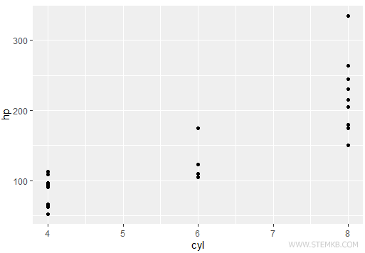
For an analysis of the relationship between two numerical variables, say "cyl" and "hp", a scatter plot is an excellent choice.
ggplot(data, aes(x=cyl, y=hp)) +
geom_point()
This plot places a dot for each data point, illuminating patterns or correlations between the two metrics.
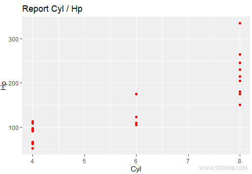
ggplot2's true strength lies in its customization flexibility.
Adding titles and altering colors is straightforward:
ggplot(data, aes(x=cyl, y=hp)) +
geom_point(color="red") +
ggtitle("Cylinder / Horsepower Overview") +
xlab("Cylinders") +
ylab("Horsepower")
The chart now features red dots, enhanced with clear axis labels and a descriptive title.
Moving on to a practical example:
Let's examine the relationship between fuel efficiency ("mpg") and engine power ("hp"). A scatter plot is the tool of choice for visualizing this relationship.
Employing ggplot2, we construct a scatter plot correlating "mpg" with "hp":
ggplot(mtcars, aes (x=hp, y=mpg)) +
geom_point() +
theme_minimal() +
ggtitle("Exploring the Relationship Between Engine Power and Fuel Efficiency") +
xlab("Engine Power (hp)") +
ylab("Fuel Efficiency (mpg)")
Each point on the scatter plot represents a car in the `mtcars` dataset, mapping engine power against fuel efficiency.
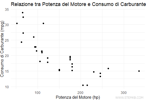
By applying theme_minimal(), the chart's aesthetics are refined for clarity, complemented by informative titles and axis labels.
Chart Interpretation: The scatter plot invites us to explore the potential relationship between engine power and fuel efficiency. Typically, a negative correlation is observed, indicating that more powerful engines usually lead to higher fuel consumption.
Upon crafting a chart that meets our expectations, we can preserve it in various formats, like PNG or PDF, with the "ggsave" function:
ggsave("my_chart.png")
Dimensions for the saved chart can be specified as well:
ggsave("my_chart.png", width = 10, height = 6)
This saves the chart as a PNG file with the specified dimensions.
While this introduction merely scratches the surface, ggplot2 offers a rich palette of features, chart types, and customization options for further exploration.
We've just begun to unlock the potential of data visualization in R.