
Histograms in the R Language
In this tutorial, we're diving into histograms in the R language.
What is a histogram? Histograms, or bar charts, are a graphical representation that helps visualize the distribution of a dataset by showing how often values fall into specific ranges. They're an incredibly useful statistical tool for exploratory data analysis, allowing you to quickly get a sense of your data's distribution.
Creating a histogram in R is straightforward—just use the hist() function.
hist(data)
Let me give you a practical example.
Imagine you have a class of 30 students and you want to visualize the distribution of their ages.
Listing every age wouldn't immediately give you an idea of the age distribution within the class. This is where the histogram comes into play: by grouping ages into ranges (for example, 18-20, 21-23, etc.) and counting how many students fall into each range, you can easily see if most students are younger, older, or if the ages are evenly distributed.
Suppose you have a vector `student_ages` containing the ages of 30 students.
student_ages <- c(19, 22, 21, 20, 23, 22, 19, 21, 20, 19, 24, 23, 22, 21, 20, 25, 23, 22, 21, 20, 19, 24, 23, 22, 21, 20, 19, 24, 23, 22)
To quickly create a histogram, use the hist() function like this:
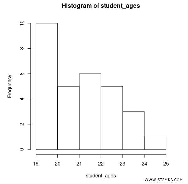
hist(student_ages)
This function generates a histogram of the students' ages.
In this case, R automatically determines the number of classes or "bins," which are the vertical bars in the histogram.
If you want to manually specify the number of classes to use, you can do so using the breaks argument.
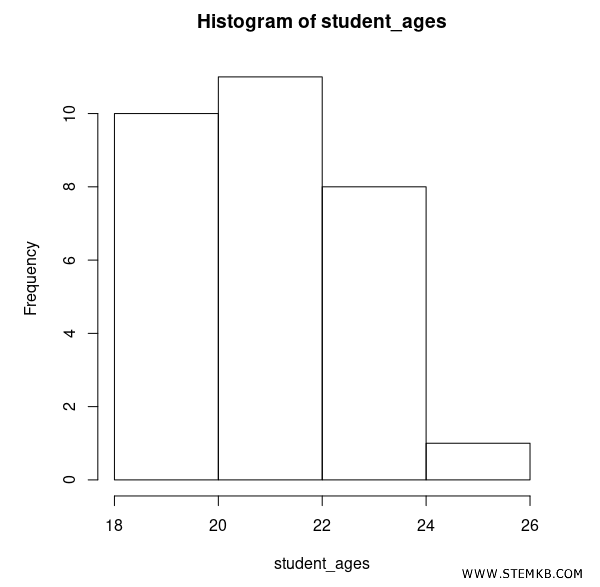
hist(student_ages, breaks=3)
The `breaks` parameter specifies the number of intervals into which the data should be divided to construct the histogram.
So, if you set `breaks` to 3, R generates a histogram with 4 classes: 18-19, 20-21, 22-23, 24-25.
You can further customize the histogram by specifying a title with the main argument.
It's also possible to specify labels for the horizontal and vertical axes with the xlab and ylab arguments, or the color of the bars through the col argument.
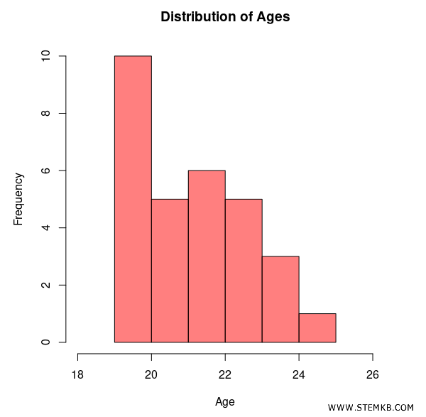
hist(student_ages, breaks=5, main="Distribution of Student Ages", xlab="Age", ylab="Frequency", col="gray")
This command assigns a title to the chart, labels the x-axis as "Age," and colors the histogram bars gray ("gray").
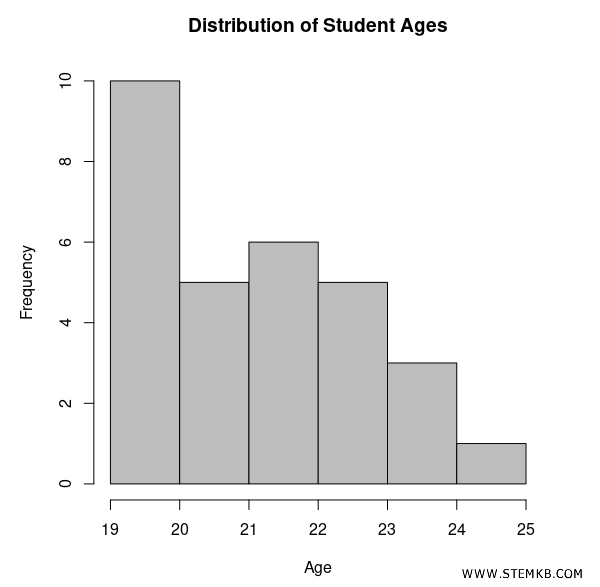
How to interpret the data? Looking at the histogram, you can start to interpret the age distribution. For instance, if you see a large bar in the 19-20 range, it means that most students are within that age range. If the histogram is symmetrical, it means the data is evenly distributed around the mean. If it's skewed to the right or left, it indicates an asymmetric distribution of data.
Overlapping Histograms
The R language also allows for the creation of overlapping histograms in the same bar chart. This feature is incredibly useful if you want to directly compare two datasets.
Let me give you a practical example.
Suppose you want to compare the age distribution of students from two different classes.
student_ages_class1 <- c(19, 22, 21, 20, 23, 22, 19, 21, 20, 19, 24, 23, 22, 21, 20, 25, 23, 22, 21, 20, 19, 24, 23, 22, 21, 20, 19, 24, 23, 22)
student_ages_class2 <- c(20, 23, 22, 21, 24, 23, 20, 22, 21, 20, 23, 24, 23, 22, 21, 24, 23, 22, 21, 20, 19, 24, 23, 22, 21, 20, 19, 24, 23, 22)
You can create two separate histograms or overlap them for a direct comparison.
Here's how you might overlap two histograms.
Start by displaying the bar chart for the first data series (class 1).
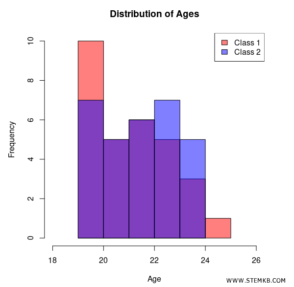
hist(student_ages_class1, col=rgb(1,0,0,0.5), xlim=c(18,26), main="Distribution of Ages", xlab="Age")
Currently, the histogram displays only one data series.
To display the second data series (class 2), execute a new hist() command with the attribute add=TRUE.
This allows you to add the second histogram without erasing the first one from the chart.
hist(student_ages_class2, col=rgb(0,0,1,0.5), add=TRUE)
The second chart (blue) for class 2 is displayed "on top" of the first chart (red) for class 1.
This way, you create two overlapping histograms with semi-transparent colors for the two classes, allowing for a direct comparison between the age distributions.
Observing the overlapping histograms, you can already notice some aspects. For instance, the first red bar stands out beneath the blue one. This means that class 1's distribution is more concentrated on the first age group 19-20 compared to class 2. Class 2's distribution, on the other hand, is more focused in the 22-24 age range.
To make the diagram easier to understand, add a legend using the legend() function.
legend("topright", legend=c("Class 1", "Class 2"), fill=c(rgb(1,0,0,0.5), rgb(0,0,1,0.5)))
In this case, the legend is added to the top right because we've indicated "topright" in the command.
In conclusion, generating histograms in R stands out for its simplicity and flexibility.
It offers you wide customization possibilities to adjust the final result to your specific analytical and presentation needs.