
Line Charts in R
Let's explore how to create line charts in R. Line charts are powerful tools for displaying trends and changes in data over time.
The beauty of R lies in its ability to simplify this process, thanks to libraries like ggplot2, part of the "tidyverse" - a suite of packages designed to make data analysis more approachable.
First off, make sure you've installed ggplot2. You can do this by installing the entire tidyverse
install.packages("tidyverse")
or just ggplot2:
install.packages("ggplot2")
Once installed, load ggplot2 into your R session:
library(ggplot2)
Now, create a simple line chart.
Imagine you have a dataset named `dati` with two columns: `anno` and `valore`, representing the observation year and the observed value, respectively.
Here's what your dataframe might look like:
dataset <- data.frame(
year = c(2010, 2011, 2012, 2013, 2014),
value = c(100, 150, 130, 200, 180)
)
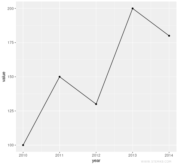
To create a simple line chart showing `valore` over `anno`, you can use `ggplot`:
ggplot(dataset, aes(x=year, y=value)) +
geom_line() +
geom_point()
Here, `aes` defines the aesthetics of the chart, assigning `anno` to the x-axis and `valore` to the y-axis.
The `geom_line()` attribute tells R to connect the points with lines, while `geom_point()` adds the data points to the chart, clearly marking the observations.
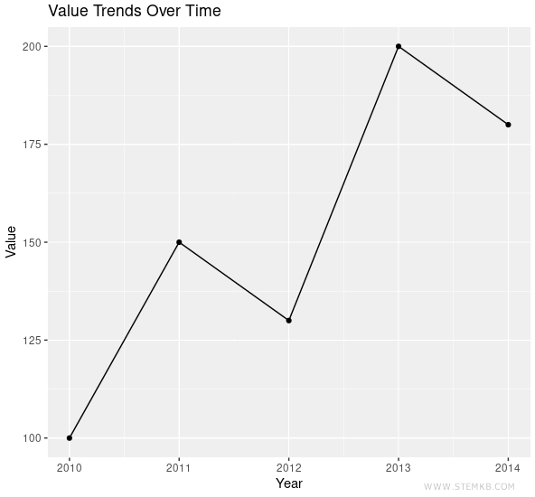
R offers numerous options for customizing your charts.
For example, you can add a title and change the axis labels:
ggplot(dataset, aes(x=year, y=value)) +
geom_line() +
geom_point() +
ggtitle("Value Trends Over Time") +
xlab("Year") +
ylab("Value")
This is the final result:
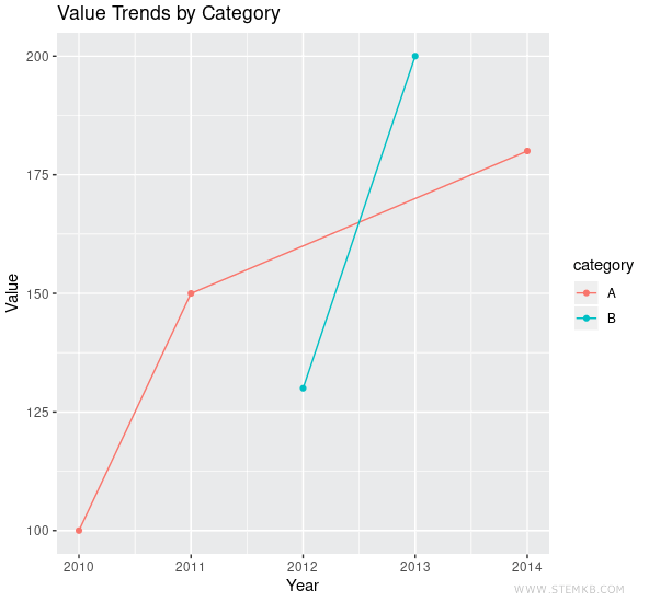
Now suppose you want to differentiate the lines by a certain category, say `categoria`, which could have values "A" or "B".
You can add a color aesthetic to visually distinguish these categories in the chart:
For instance, add a category column to the dataframe
dataset$category <- c("A", "A", "B", "B", "A")
Then create the chart
ggplot(dataset, aes(x=year, y=value, color=category)) +
geom_line() +
geom_point() +
ggtitle("Value Trends by Category") +
xlab("Year") +
ylab("Value")
This code will color the points and lines differently based on the `categoria` value.
Making attractive charts in R is as much an art as it is a science.
By delving into ggplot2 and the rest of the tidyverse, you'll uncover a wide array of additional functionalities.
Remember, the key is to experiment and have fun with your data!