
Visualizing Data with Graphs
When exploring the relationship between two variables in a scientific or practical context, Cartesian graphs are an indispensable tool.
First introduced in 1637 by the French philosopher and mathematician René Descartes (also known as Cartesius), these diagrams offer a clear and intuitive way to represent data and relationships. What started as a groundbreaking 17th-century idea is now a vital tool for transforming raw data into meaningful insights.
A Cartesian graph is based on two perpendicular axes:
- The horizontal axis (x-axis), typically used for the independent variable.
- The vertical axis (y-axis), representing the dependent variable.
Each point on the graph corresponds to a pair of values, one for each axis.
A Practical Example
Let’s examine the relationship between time and the distance traveled by a cyclist.
We’ll plot time on the x-axis and distance on the y-axis.
Suppose we have recorded data for a cyclist starting from rest. The table below shows the values collected at 15-minute intervals:
| Time \( t \) (min) | Distance \( d \) (km) |
|---|---|
| 0 | 0 |
| 15 | 4 |
| 30 | 8 |
| 45 | 12 |
| 60 | 16 |
| 75 | 20 |
| 90 | 24 |
We can represent this data on a Cartesian graph:
- On the x-axis (\( t \)), we use 15-minute intervals as our unit.
- On the y-axis (\( d \)), we choose a scale that makes the distances easy to read, such as 4 km per unit.
The plotted points (\( t, d \)) form a straight line, indicating a linear relationship between time and distance. This suggests that the cyclist is traveling at a constant speed: for every 15-minute interval, they cover 4 km.
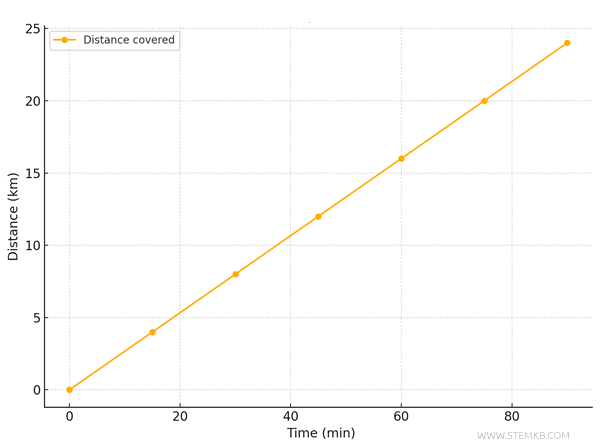
At a glance, you can immediately recognize the consistent speed, as the graph is a straight line. The slope of this line represents the cyclist’s speed.
In this case, the cyclist travels 4 km every 15 minutes, translating to a speed of 16 km/h.
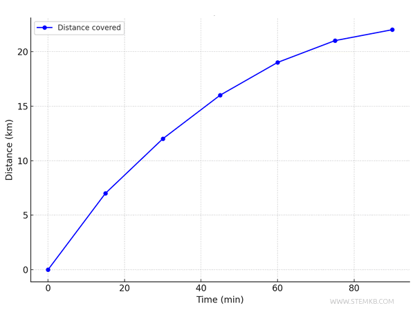
Example 2
Now, let’s look at what happens when the recorded data tells a different story.
A second cyclist takes the same route.
| Time \( t \) (min) | Distance \( d \) (km) |
|---|---|
| 0 | 0 |
| 15 | 7 |
| 30 | 12 |
| 45 | 16 |
| 60 | 19 |
| 75 | 21 |
| 90 | 22 |
This time, the graph shows a different pattern.
The curved line reveals that the cyclist’s speed is not consistent. Initially, they ride faster but gradually slow down, possibly due to fatigue.
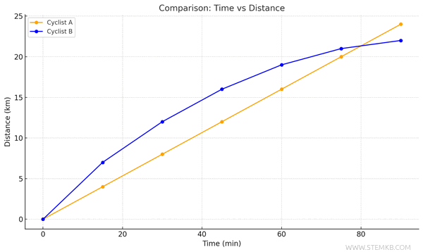
By comparing the two graphs on the same chart, it becomes clear that the first cyclist, who maintains a steady speed, covers a greater distance and eventually overtakes the second cyclist.
Why Use Graphical Representations?
Cartesian graphs provide insights at a glance that might not be as obvious when looking solely at numerical data.
In conclusion, graphs transform numbers into visual communication tools, making data more accessible and easier to interpret.