
Creating Bar Charts in MATLAB
In this tutorial, I'll show you how to create and visualize histograms in MATLAB.
First, let's ponder what a histogram is. In the realm of statistics, a histogram is a graphical tool that unveils the frequency distribution of a dataset. It's akin to a bar chart, with bars arranged either vertically or horizontally, painting a vivid picture of our data.
Now, let's dive into a hands-on example to see how this works in practice.
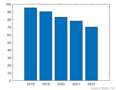
Suppose we have an array of years "x", ranging from 2018 to 2022.
>> X = [ 2018 2019 2020 2021 2022 ]
Next, let's create another array "y" with some fascinating numbers, such as the points earned by a team in the championship.
>> y = [ 95 90 83 78 70 ]
Note. Keep in mind that both arrays must have the same number of elements for our experiment to work.
Now, we're ready to construct our bar chart.
We'll invoke the bar(X,y) function, which will craft a beautiful histogram before our very eyes
>> bar(X,y)
With this, the horizontal axis of our Cartesian plane displays data from the X array, while the vertical axis showcases data from the y array.
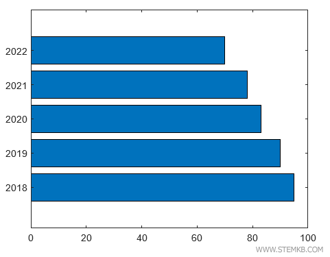
But wait! There's another way to represent our histogram – by arranging the bars horizontally.
We can summon the barh(X,y) function to make this happen.
barh(X,y)
This time, the vertical axis displays data from the X array, while the horizontal axis represents data from the y array.
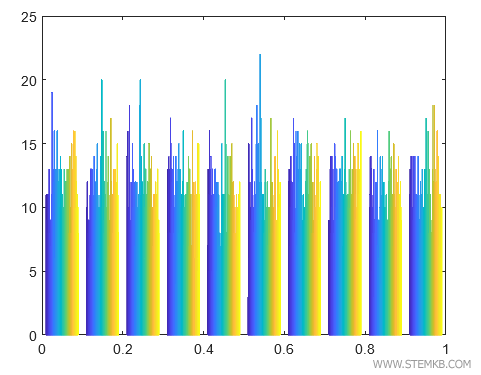
Another function for representing histograms in MATLAB is the hist() function.
This function is particularly valuable when dealing with a vast array of data points.
Imagine we have an array with 100 random numbers between 0 and 1.
>> X = rand(100);
We'll employ the hist(X) function to reveal the histogram of our data distribution.
>> hist(X)
Voilà! MATLAB presents the histogram, with the elements of the array on the horizontal axis and their frequency on the vertical axis.
Sull'asse orizzontale sono indicati gli elementi dell'array mentre sull'asse verticale la loro frequenza.
Note. Take a moment to observe the chart. You'll notice that MATLAB conjured these random numbers using a uniform distribution. In this type of distribution, every number between 0 and 1 shares an equal chance of being generated.
And so, with this newfound knowledge, you're equipped to represent any histogram in MATLAB.