
Creating 2D Graphs in MATLAB
Let me explain to you how to make a 2D graph on Matlab.
Now, before we get started, you should already know what an array is and how to create one. If you don't, I suggest you take a look at the lesson on arrays in Matlab first.
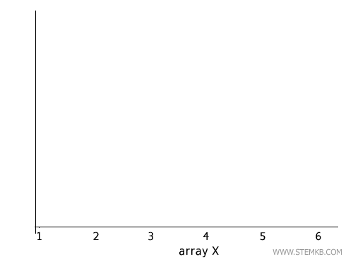
So, let's create an array x by writing a sequence of numbers from 1 to 6.
Just type X = [1 2 3 4 5 6] on the command line and hit enter.
>> X = [ 1 2 3 4 5 6 ]
x =
1 2 3 4 5 6
Now, these values are the projections of the points of the graph on the x-axis, the horizontal axis of the Cartesian plane.
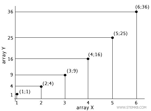
Next, create another array Y to indicate the projections of the points on the y-axis, the vertical axis of the Cartesian plane.
Just type Y=X.^2 on the command line and hit enter.
>> Y=X.^2
Y =
1 4 9 16 25 36
What Matlab does here is it reads the values of the X array, calculates the square of each value, and stores it in the Y array.
$$ 1^1 = 1 \\ 2^2 = 4 \\ 3^2 = 9 \\ 4^2 = 16 \\ 5^2 = 25 $$
Now you have two arrays X and Y that form the coordinates (x,y) of the points on the graph.
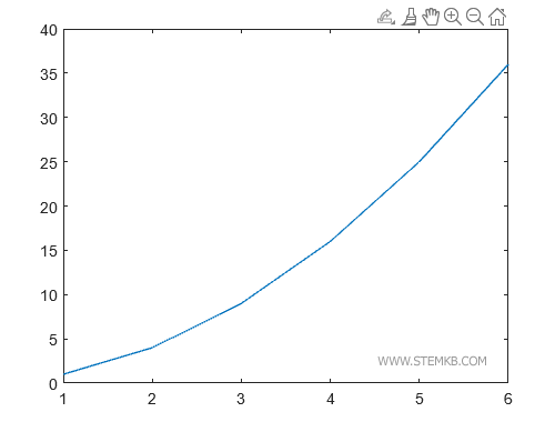
To draw the graph using a broken line, just type plot(X,Y).
>> plot(X,Y)
This function has two parameters.
- The first parameter is the array X with the values of the coordinates on the x-axis
- The second parameter is the array Y with the values of the coordinates on the y-axis.
MATLAB prints a two-dimensional graph on the screen.
Now, let me show you another example.
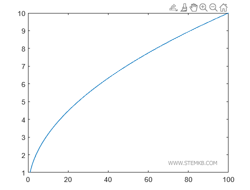
When you have a lot of values to consider, it's best to use the linspace() function.
For example, type X=linspace(1,100) to create the array X with the integer numbers from 1 to 100.
>> X = linspace(1,100);
This way you avoid having to type all the values on the X-axis one by one.
Then create the vector Y of the values on the y-axis by typing Y=sqrt(X).
>> Y=sqrt(X);
The X and Y arrays are made up of 100 elements.
Note. When you calculate an array with a lot of elements, remember to add a semicolon at the end of the command. This way, you avoid printing the results on the console and the calculation becomes faster.
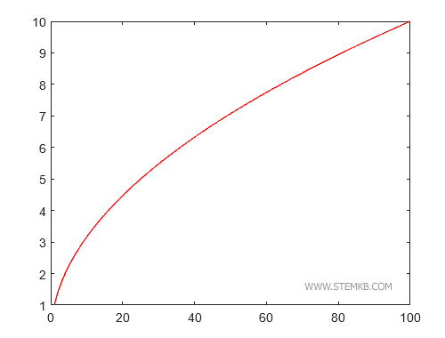
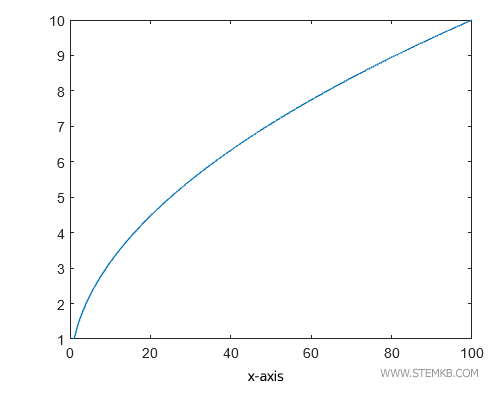
Now type plot(X,Y) to draw the graph on your PC screen.
>> plot(X,Y)
MATLAB prints the graph of the square root from 1 to 100.
To change the color of the graph, use the Color attribute.
For example, type plot(X,Y,'Color','red') to draw the graph using the color red.
>> X = linspace(1,100);
>> Y=sqrt(X);
>> plot(X,Y, 'Color' , 'red')
MATLAB draws the graph using the color you specified in the Color attribute.
In this case, I chose the color red. So, the graph line is red.
Other predefined colors are green, blue, cyan, magenta, yellow, black, white, none.
Let's take a look at how to modify the thickness of a line in a graph using Matlab.
You can do this by using the Linewidth attribute, followed by an integer value.
For instance, if you have defined two vectors X and Y, you can plot the graph using the command plot(X,Y,'Color','red','Linewidth',3) to draw a line with a thickness of 3 pixels.
>> X = linspace(1,100);
>> Y=sqrt(X);
>> plot(X,Y, 'Color' , 'red', 'Linewidth', 3)
Matlab draws the plot using the thickness indicated after the attribute.
In this case, we have chosen a thickness of 3 pixels.
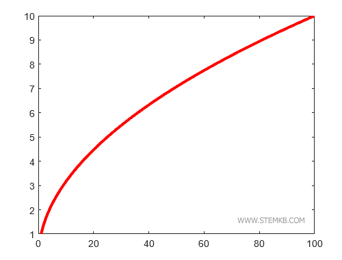
When you do not use the Linewidth attribute, Matlab draws lines with a thickness of 1.
How to draw markers instead of the line?
Alternatively, if you want to use markers instead of a continuous line, you can specify the marker symbol to use, such as '+' or '.', using the command plot(X,Y,'+', 'Color', 'red') or plot(X,Y,'.', 'Color', 'red') respectively.
>> plot(X,Y, '+', 'Color' , 'red')
Matlab draws the plot by displaying the + symbol at each (x, y) coordinate of the plot.
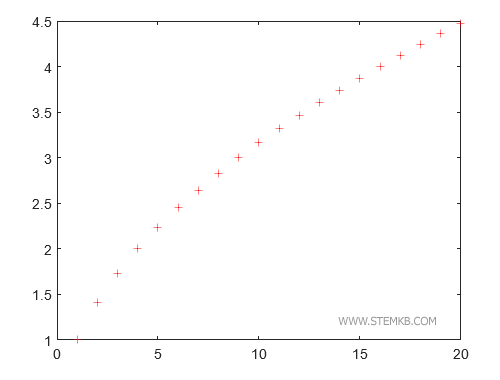
You can also use other symbols such as 'x', 'o', '-', etc.
The graphical effect obtained using the point as a marker is particularly useful.
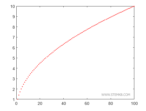
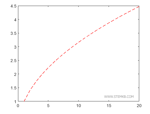
Another very useful marker is the double dash '- -'
>> plot(X,Y, '--', 'Color' , 'red')
In this case, Matlab draws the graph line in a dashed way.
How to add axis names?
To add labels to the x and y axes of the graph, you can use the xlabel and ylabel functions.
For instance, typing xlabel('x') after the plot command will add the label 'x' below the horizontal axis, while typing "ylabel('y')" will add the label 'y' to the left of the vertical axis.
>> X = linspace(1,100);
>> Y=sqrt(X);
>> plot(X,Y)
>> xlabel('x-axis')
Matlab adds the label below the horizontal axis.
Then type ylabel('y')
>> X = linspace(1,100);
>> Y=sqrt(X);
>> plot(X,Y)
>> xlabel('x-axis')
>> ylabel('y-axis')
This command adds the label to the left of the vertical axis.
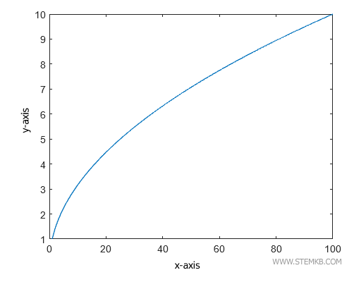
Now the axis names are visible in the plot.
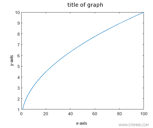
How to add a title to the plot?
Similarly, to add a title to the graph, you can use the title function, such as title('Graph Title') after the plot command.
>> X = linspace(1,100);
>> Y=sqrt(X);
>> plot(X,Y)
>> xlabel('x-axis')
>> ylabel('y-axis')
>> title('title of graph')
The xtitle() function displays the plot title above the Cartesian diagram.
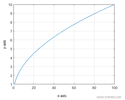
How to display the grid?
If you want to display a grid on the graph, you can use the command grid on.
>> X = linspace(1,100);
>> Y=sqrt(X);
>> plot(X,Y)
>> xlabel('x-axis')
>> ylabel('y-axis')
>> grid on
The grid on command adds the vertical and horizontal lines to the Cartesian diagram.
Conversely, to turn off the grid, you can use grid off.
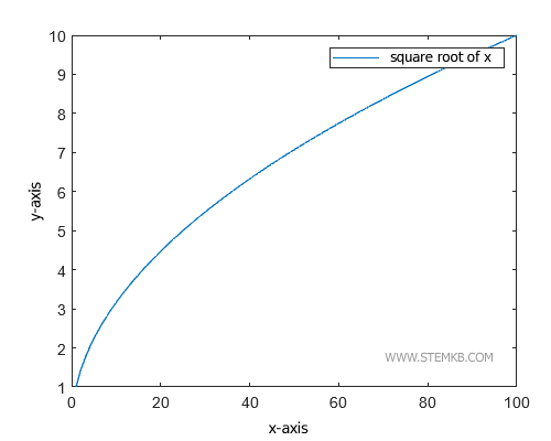
How to display a legend?
To add a legend to the graph, you can use the legend function, such as legend('Square Root of X') to add a label next to the graph.
>> X = linspace(1,100);
>> Y=sqrt(X);
>> plot(X,Y)
>> xlabel('x-axis')
>> ylabel('y-axis')
>> legend('square root of x');
Matlab displays the legend next to the plot.
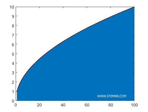
How to color the area below the plot?
Finally, if you want to color the area under the graph, you can use the function area(X,Y) in place of the "plot(X,Y)" command.
>> X = linspace(1,100);
>> Y=sqrt(X);
>> area(X,Y)
This function will color the area below the graph.
That's how you can modify the thickness of a line, use markers, add labels, titles, grids, legends, and color the area under the graph using Matlab.
In the upcoming lessons, we will delve into how to customize graphs, create histograms, 3D graphs, and more.