
Creating Pie Charts in Matlab
I'm going to teach you how to create pie charts in Matlab, and I promise, it's going to be fun and simple.
So, first things first, what is a pie chart? Imagine you have a pie, and you slice it up to represent different categories. Each slice shows a percentage of the whole pie, and it's a pretty neat way to visualize data, often used in statistics and marketing.
Let me walk you through an example.
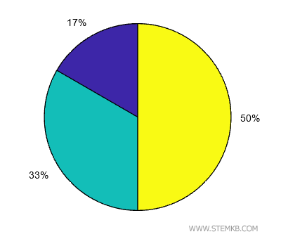
Start by creating an array with three values:
>> x = [ 5 , 10 , 15 ];
This gives us a total of 30 (5+10+15).
Next, let's whip up the pie chart by simply typing pie(x)
>> pie(x)
And there you have it! Matlab will generate a beautiful pie chart with each slice representing the corresponding percentage.
In the pie chart, the value 15 represents half of the pie because 15 is 50% of the total (30).
The values 10 and 5 are represented with proportionally smaller slices, respectively 33% and 17% of the total.
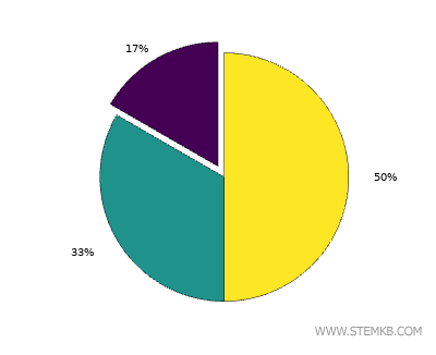
Sometimes, you may want to emphasize a slice by detaching it from the rest of the pie.
To do this, create another array b[1,0,0], where you specify the edge of the slices:
>> b = [ 1 , 0 , 0 ];
his array has the same number of elements as x and separates the first slice from the others.
Now, type pie(x,b) to draw your fancy pie chart.
>> pie(x,b)
Voilà! The first slice stands out from the rest.
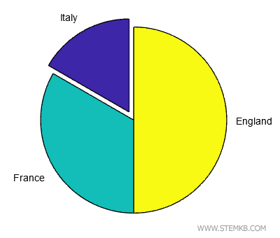
If you'd like to label the slices instead of showing percentages, create a cell array with the names of the labels.
>> label={"Italy","France","England"};
Finally, type pie(x,b,label) to generate the pie chart with labels.
>> pie(x,b,label)
And there you have it—a pie chart with labeled slices.
So, that's how you create and customize pie charts in Matlab.