
Polar Histograms in Matlab
In this tutorial, I'll guide you through the process of drawing a polar histogram using Matlab.
So, what exactly is a polar histogram? A polar histogram is simply a bar chart, but with a twist. Instead of plotting it on a Cartesian grid, we place it on a polar coordinate system. The bars, in this case, represent polar coordinates. The length of each bar is a reflection of how often a specific polar coordinate appears in our dataset.
Now, let's explore a practical example of a polar histogram.
We'll start by creating an array of polar values between 0 and 2π radians, equivalent to 0 and 360°.
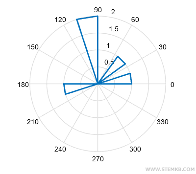
>> x=[0, pi/2, pi, pi/4, pi/2];
Our array, x, has a total of 5 values.
Upon examining the array, we can see that the value π/2 radians (90°) appears twice, while the remaining values only show up once.
Therefore, the value π/2 has a higher absolute frequency compared to the others.
To draw the polar histogram, employ the rose() function.
>> PolarGraph = rose(x)
This function saves the graph in the PolarGraph variable while simultaneously revealing the polar histogram on your screen.
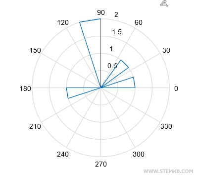
If the lines seem a tad too thin for your liking, fear not! The set() function comes to the rescue.
set(PolarGraph,"LineWidth",2);
Now, observe the striking difference in the length of the bars. The bar representing π/2 (90°) is quite a bit longer than its counterparts.
To be precise, the π/2 bar has a radius of 2, double that of the other bars.
This discrepancy is simply due to the fact that the value of π/2 makes two appearances in the array x, while the others only show up once.
The other values, on the other hand, have a radius of 1 because they only appear once in the array.